INDUSTRY:
EdTech
YEAR:
2025
ROLE:
UX/UI Design, Information Architecture
TIMELINE:
2 Weeks, Part-time, Solo Project
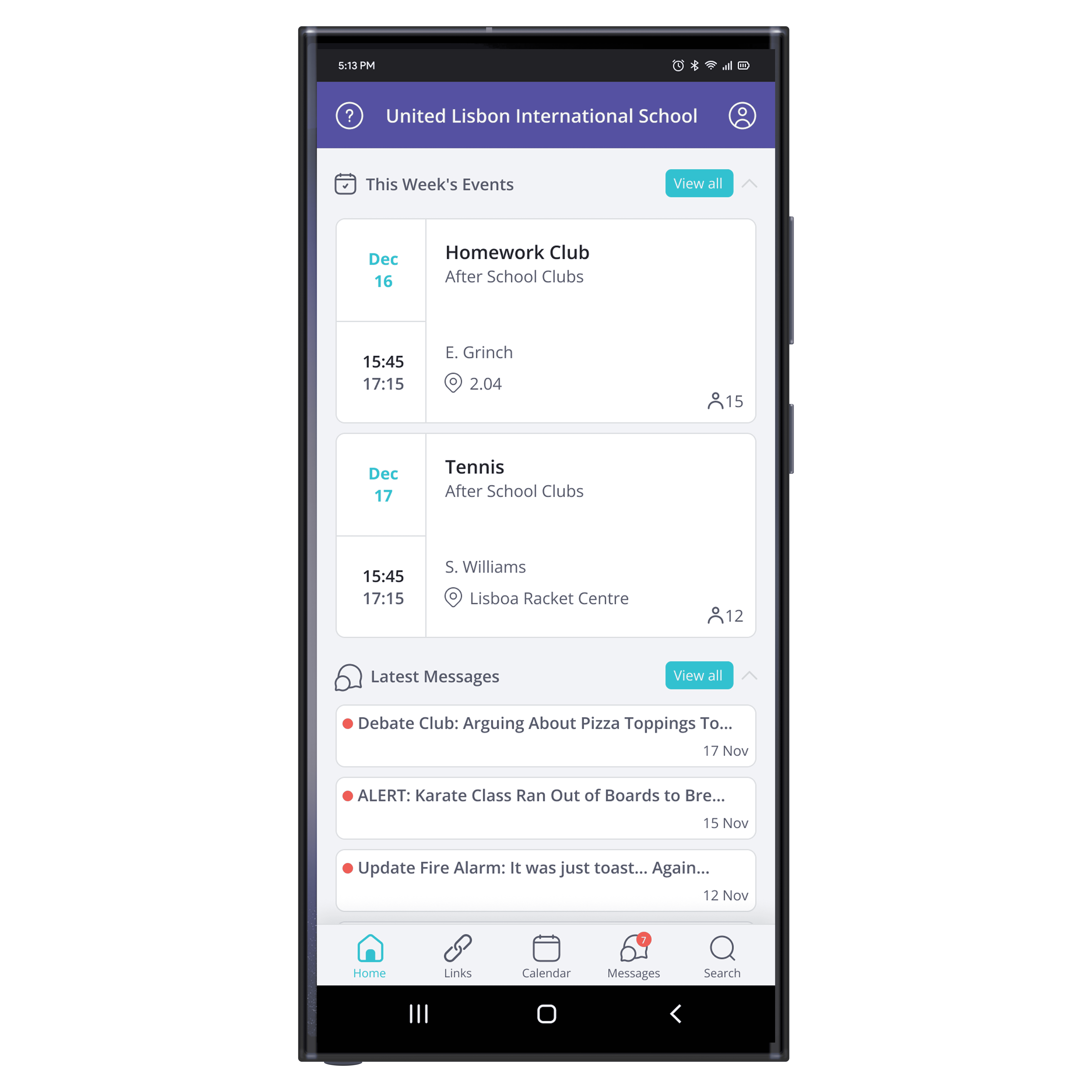
SchoolsBuddy is a school-management app used by teachers, parents, and administrators. As a daily user in my own teaching experience, I noticed the teacher interface wasn’t designed for the real pace and chaos of a school day, especially when managing after-school clubs. During my UX/UI bootcamp, I took on a challenge to redesign the teacher view. My goal was to make it more intuitive, modern, and genuinely useful: less time wasted clicking, more time supporting students.
This was a solo mini-project completed over two weeks. I led the work from research through prototyping and visual design, prioritizing changes that would make a real difference for teachers.


challenge
Teachers using SchoolsBuddy described the experience as cluttered, confusing, and inefficient. A few core pain points emerged:
Visual overload: The app’s color palette was harsh, with overly high contrast and no clear visual hierarchy.
Poor organization: Lists weren’t logically ordered, labels were repetitive, and navigation felt fragmented.
Distracting loading animation: An over-the-top animation made the app feel buggy or unpolished.
Hidden help content: The “info” button on the home screen only showed a welcome message. Real assistance was buried in account settings.

Solution
To ground my redesign, I conducted a heuristic evaluation using Nielsen’s 10 usability heuristics, and gathered user feedback from teacher-colleagues who use SchoolsBuddy daily. I also performed a competitive analysis (looking at tools like EvolveGo, SOCS, and PikmyKid), and noticed many of them used cleaner layouts, more thoughtful color palettes, and simpler organization.
From these insights, I focused on key areas:
Simplifying the color scheme, aligning it more closely with SchoolsBuddy’s brand website and introducing accents for clarity.
Restructuring the information architecture: creating a cleaner layout with logical ordering and clearer labels.
Simplifying the loading animation so it felt smooth and intentional rather than chaotic or buggy.
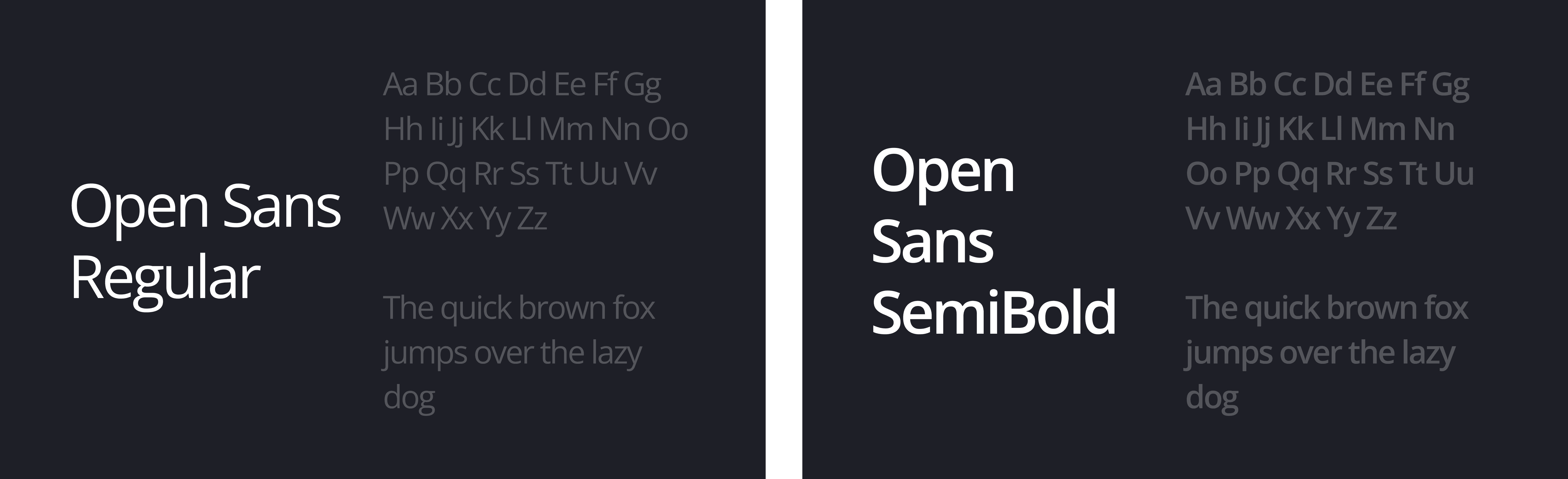
I updated the typography to Open Sans to improve readability for teachers who skim quickly between tasks. The final screens were refined focusing strongly on clarity and usability.
After a feedback round, a few major comments emerged:
The onboarding flow and navigation felt more intuitive.
The simplified palette reduced visual fatigue.
Teachers appreciated the more purposeful iconography and transitions.
Looking back, I would deepen accessibility work (higher contrast, better tap targets, more padding). Feedback also suggested that some icons and elements used weren’t as intuitive for all users as I thought.
Overall, the final concept delivers a calmer and more efficient space for teachers to manage activities, and navigate their daily responsibilities. It reflects a design approach that listens to user needs and supports the fast-paced reality of school life.