INDUSTRY:
Non‑profit civil society (NGO)
CLIENT:
ILGA Portugal
YEAR:
2025
ROLE:
UX/UI Design, Accessibility Design
TIMELINE:
6 Weeks, Part-Time, Solo Project

Navigating a website shouldn’t feel like solving a puzzle, yet ILGA Portugal’s site created barriers for the very people it exists to support. This project reimagined the site so anyone seeking information, events, or help could find it quickly and confidently.
It began with a core question: How do you design a digital space that truly serves a marginalized community with clarity, warmth, and care?
ILGA Portugal has been the country’s leading LGBTQIA+ advocacy organization since 1995, grounded in three pillars: political advocacy, support services, and community empowerment. However, usability testing revealed that many first-time visitors struggled to understand ILGA’s mission within seconds of landing on the homepage.
Over six weeks, I conducted stakeholder interviews, competitive benchmarking, accessibility research, and two rounds of usability testing. As a solo designer, I led the full process from research through high-fidelity prototyping, focusing on building an experience that felt accessible, inclusive, and structurally clear.

challenge
The existing website struggled with information clarity and structural hierarchy.
In usability testing with 6 participants:
67% had never heard of ILGA before
100% had never used the website
50% misinterpreted the homepage as an employment agency
83% struggled to find events
50% could not intuitively locate resources
Participants included LGBTQIA+ community members, culturally informed allies, a user with hearing impairment, and neurodivergent (ADHD) participants. Most were immigrants living in Portugal, reflecting real first-time user scenarios.
Key pain points included:
No clearly labeled “Events” section despite strong user expectation
Confusion between “Activities,” “Projects,” and “Programs”
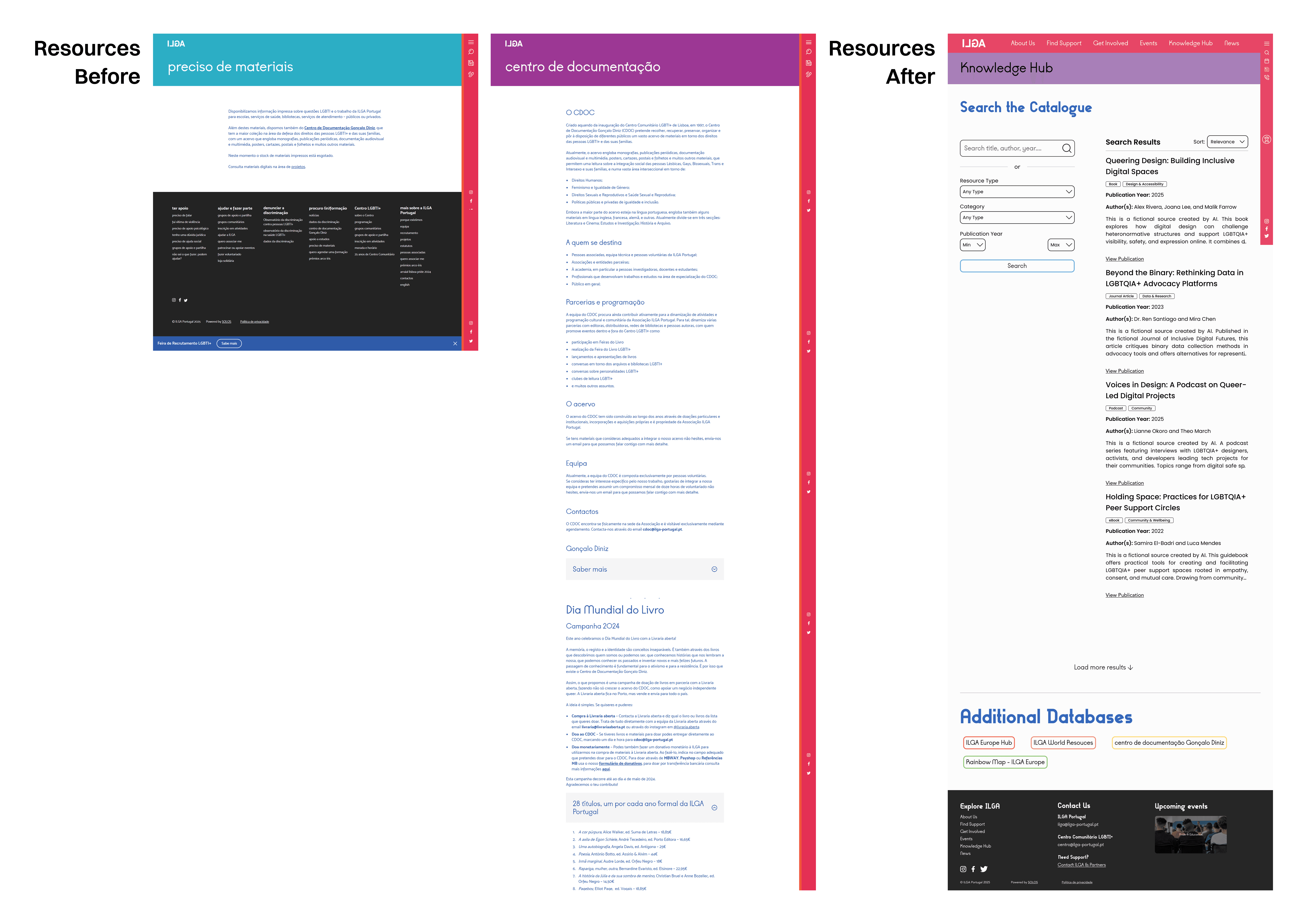
Resources scattered across unclear categories
Footer preferred over main hamburger menu due to visibility and easy access
Accessibility gaps including contrast limitations and lack of font resizing
A stakeholder conversation reinforced the structural issue:
“Many people don’t immediately understand what ILGA does. Our critical work is buried, and users rely on Google to find our own pages.”


Solution
Through stakeholder interviews, competitive analysis of five NGOs, Nielsen’s usability heuristics evaluation, and research into WCAG accessibility standards, one principle became clear: the site needed to reflect user mental models, not internal terminology.
I redesigned the information architecture around five main user-centered sections:
Homepage – clearly communicating ILGA’s mission and three pillars within seconds
Events – a dedicated, intuitive hub for community gatherings and campaigns
Knowledge Hub – a centralized space for resources, research, and policy documents
Get Involved – clear pathways for volunteering and advocacy participation
Support – direct access to legal, mental health, and community services
The revised structure eliminated guesswork and reduced cognitive load.
In a second round of usability testing with the redesigned website participants:
100% completed tasks independently across all scenarios
Immediately recognized ILGA’s mission upon entering the prototype
Had no confusion around events or homepage purpose
Identified minor refinements, such as sorting icons and CTA language, which were modified afterwards according to the feedback
Accessibility was integrated throughout the redesign:
Improved color contrast while maintaining brand identity
Larger, readable buttons with inclusive and action-oriented CTAs
Improved typography hierarchy and spacing
Consideration for dark mode, font resizing, and captioned media
The final high-fidelity prototype reflects a site that is structurally clear, emotionally welcoming, and aligned with ILGA’s advocacy mission.
Although not yet implemented, the redesign demonstrated measurable improvement in task success, brand clarity, and navigation efficiency, and I remain in contact with ILGA leadership regarding potential implementation.
The result is a website that acts as a true digital home, empowering visitors with clear pathways for support, engagement, learning, and community.