INDUSTRY:
Wellness Nutrition
CLIENT:
Himalayan Bone Broth
YEAR:
2024
ROLE:
UX/UI Design, Content Strategy
TIMELINE:
5 Weeks, Part-time, Team Project
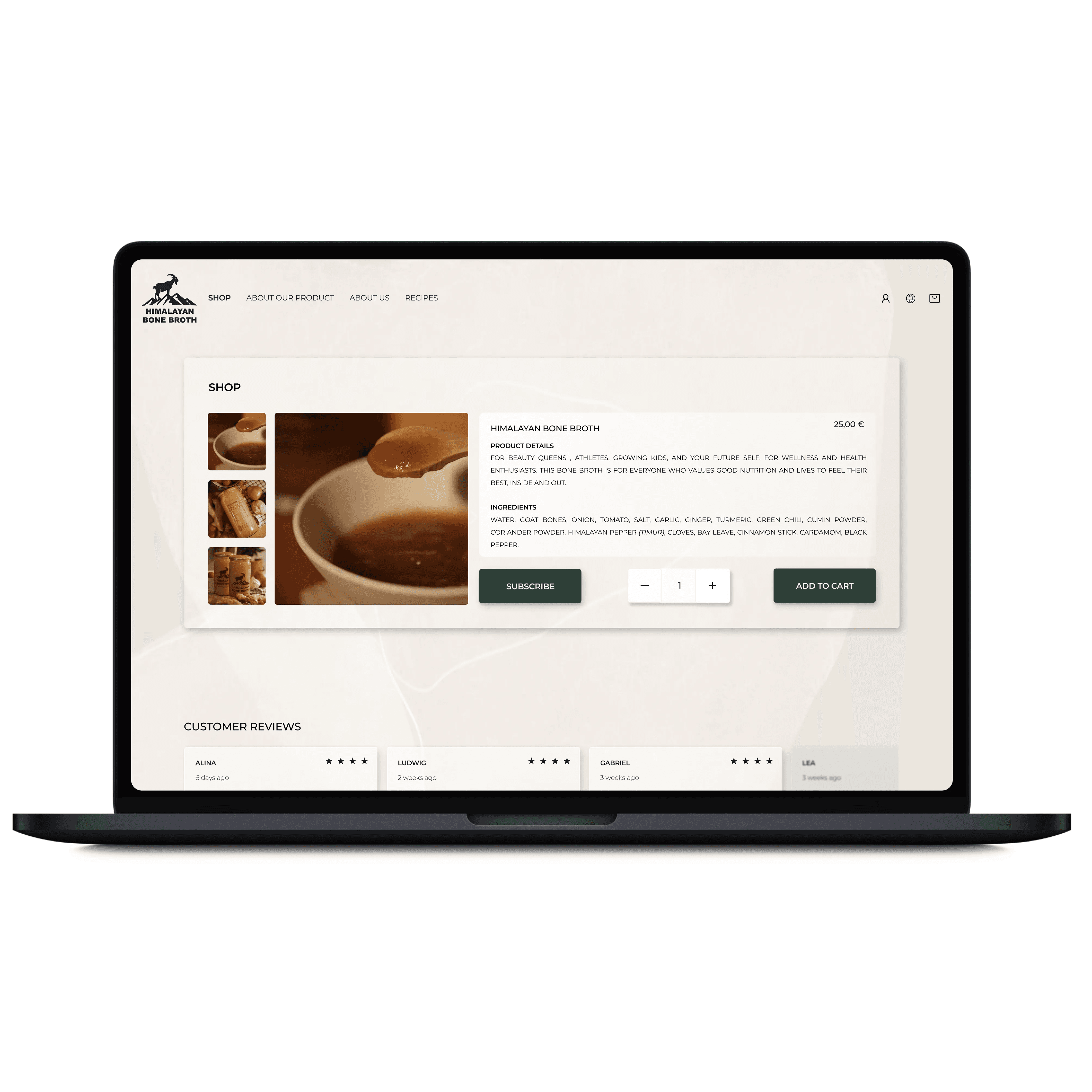
Trust has become a form of currency in today’s online marketplace. Users expect transparency, authenticity, and clarity before they commit, especially when shopping for health-related products. This UX/UI project focused on creating a user-centered design blueprint for Himalayan Bone Broth’s e-commerce platform, a brand looking to introduce a traditionally inspired bone broth product to health-conscious consumers. Throughout the process I focused on providing the users with honest information, clear navigation, and an experience that reflects the brand’s values of purity and reliability.
challenge
Many health-conscious consumers are skeptical about products. Confusing marketing, vague ingredient claims, or unclear ingredient sourcing leave them uncertain about what they’re actually putting into their bodies. During initial interviews, users shared that they often feel unsure whether “all-natural” products are genuinely transparent in their claims. This lack of clarity influenced trust before they even reached the checkout.
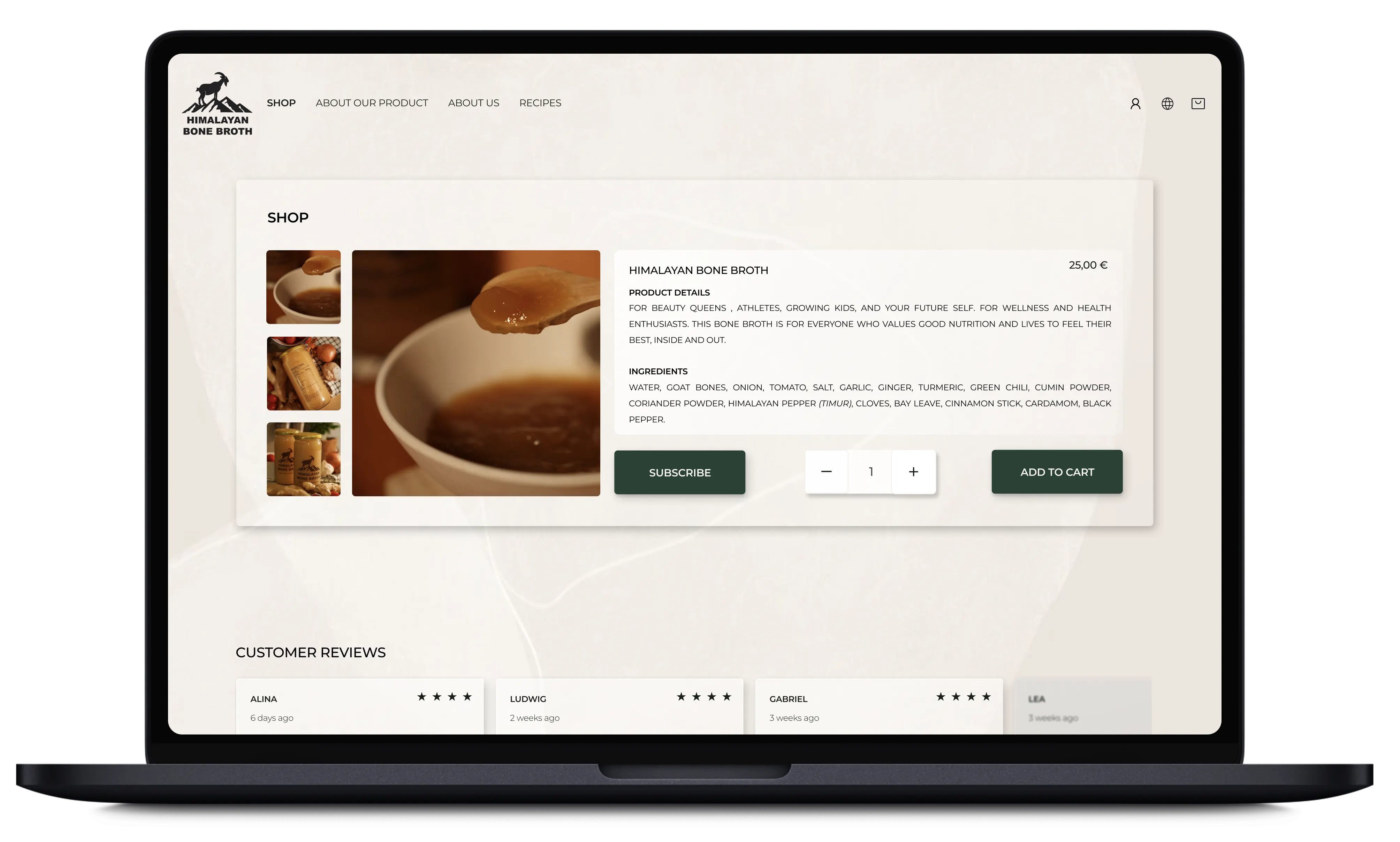
For Himalayan Bone Broth, the key challenge was: how can we design a site that feels honest, clear, and trustworthy from the first glance. The website had to not only showcase product benefits and ingredients but also make detailed nutritional and sourcing information accessible in an easy to digest way. We needed to ensure the interface itself didn’t create friction or doubt, because when trust is the product, small UX choices matter a lot.

Solution
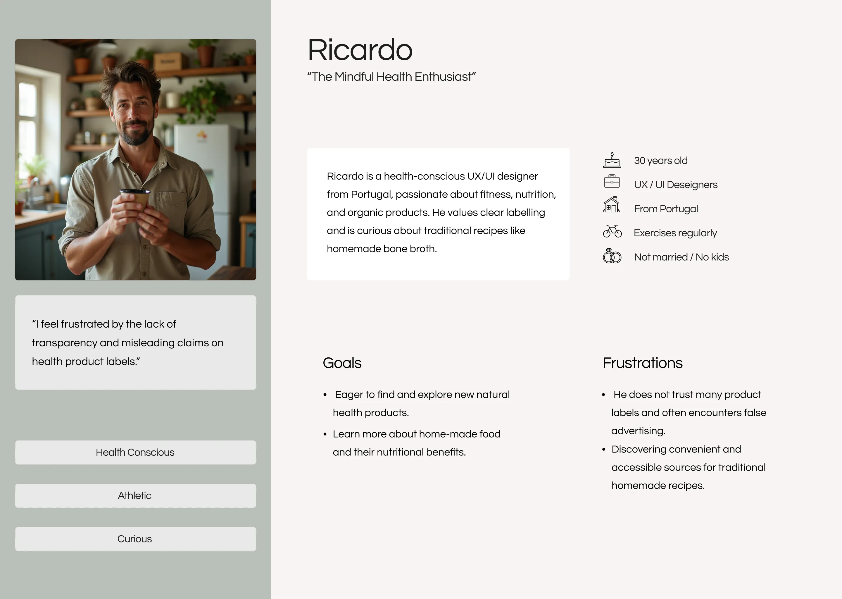
To build trust from the ground up, we based our design decisions on user interviews and feedback. We interviewed people with healthy lifestyles and wellness-oriented values. They came from different backgrounds and geographies but shared a demand for transparency around ingredients, sourcing, and health claims. From that, we developed the persona Ricardo, representing consumers who need clear, honest communication before they can feel confident buying the product.
We mapped Ricardo’s user journey from discovering the product to making a confident purchase and used that to define key design goals: authenticity, clarity, and ease. Competitive analysis showed what other brands were doing well (friendly, clean layouts; clear ingredient lists; easy navigation) and what felt confusing or untrustworthy.
With those insights, we built:
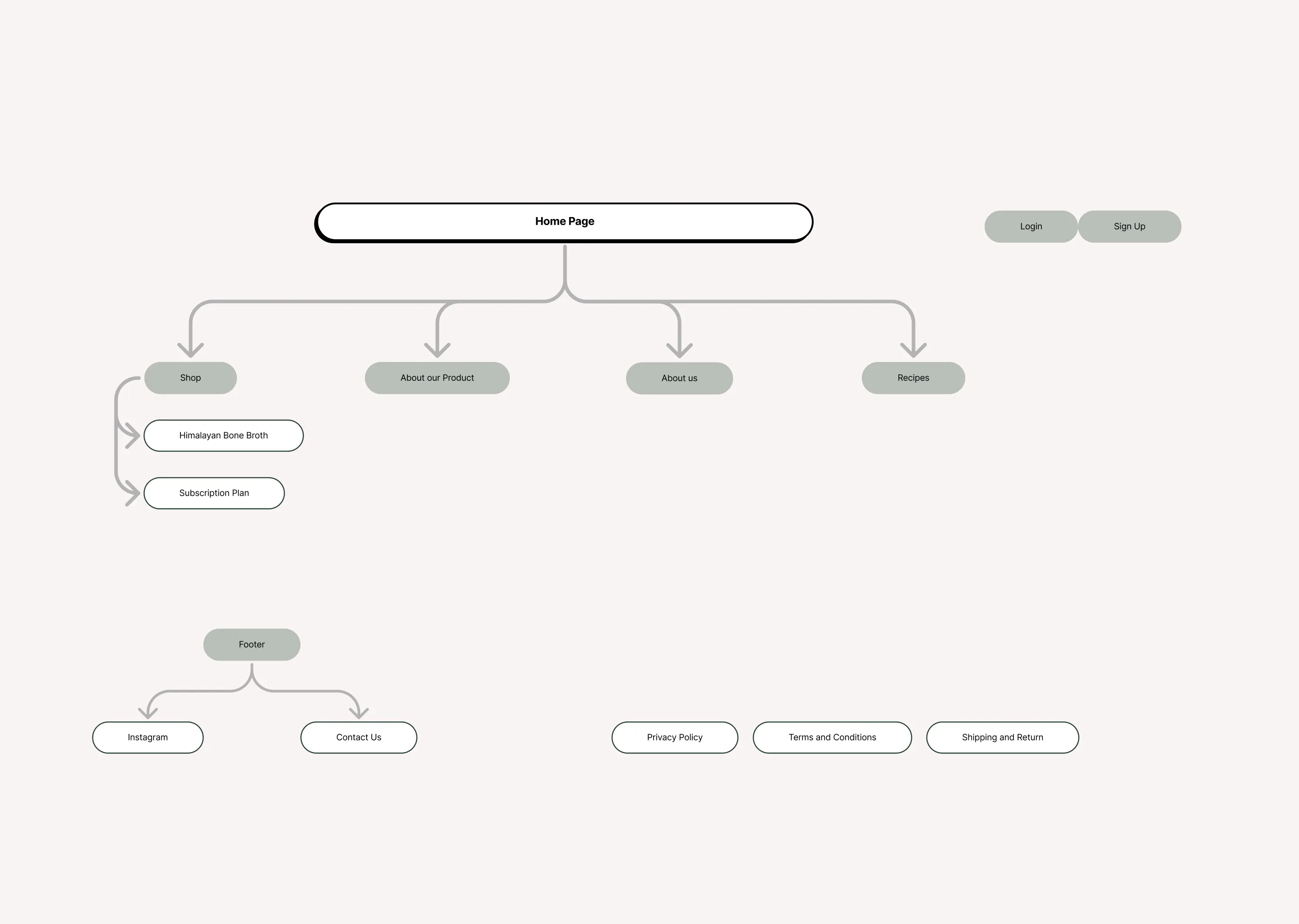
a clear site structure and sitemap that organizes content logically, avoiding clutter or misleading category names
user flows that lead the users from browsing to purchase, without overwhelming them, giving them control and time to digest the information
UX writing that emphasizes transparency: straightforward ingredient and benefit descriptions, honest copywriting, and no misleading claims
a clean aesthetic that supports readability and reduces cognitive load, helping users feel grounded rather than overwhelmed
When we tested wireframes and prototype with users, feedback confirmed the approach: users said the site felt open, clear, and trustworthy. They appreciated easy access to all relevant information and a straightforward path to purchase.
The design doesn’t try to “sell” and push the product to the users, but rather aims to inform and empower them. It gives users what they need to make a confident independent decisions, respecting their skepticism and valuing their need for clarity.


Testimonial
Noora combined strong user research with a real eye for design. She understood that our biggest challenge was earning consumer trust, and she solved it. Building a website blueprint that makes our product's authenticity and ingredients clear and easy to navigate. Thoughtful, collaborative, and always focused on the end user. I'd work with her again in a heartbeat.

Leticia Moresca
Founder of Himalayan Bone Broth

